
Odd Verdure (Jam Version)
UI Design at Lower Resolutions
User Interface design is already a deep and intricate subject. By restricting the resolution of a game, it adds a new aspect to the challenge of creating an intuitive and informative interface for players by increasing contention for screen space.
The job of the User Interface
The responsibilities of the User Interface can drastically change depending on the underlying application / genre. A JRPG likely has significantly more information to provide the player with when compared against a 2D platformer. At a basic and somewhat abstract level, the UI’s job is to keep the player informed and allow them to either easily do what they want to or to better plan what they want to do in the game. In practice, that can manifest itself very differently on a case-by-case basis.
Resolution
Modern games running at 1080p or greater have a lot of real estate to work with. Older games, even outside of handheld consoles, had to wrestle with screen space to build their UIs while still preserving space for the gameplay to occupy. Handheld consoles, such as the Nintendo Game Boy, took this to the limits. As a quick comparison, a 1080p screen has more than 2 million pixels to work with. A Game Boy screen is 160x144, which totals 23,040 pixels. That means a 1080p display has 90 times the pixels to work with. Many games of the era had incredibly minimal UIs in order to leave as much of the screen for gameplay as possible.
Most games of the Game Boy era took one of two approaches: minimalist UI’s or a dedicated area on screen for all UI elements that we’ll refer to as a “UI Bar”.
Minimalist
Let’s look at the opening gameplay in 1989’s Castlevania Adventure as an example of a minimalist UI that sits directly on top of the gameplay:
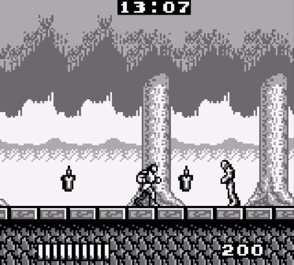
There are only 3 UI elements on screen:
- Timer
- Health
- Points
Convention and experimentation by the player are the only ways to discern what each element represents. Is it obvious that the stack of bars in the bottom left is the health without it being explicitly labeled “HP”, or something similar? Not really, but the player will likely learn quickly that once those bars run out, it forces them to restart the level.
UI Bar
1995’s Kirby’s Dream Land 2 takes the approach of carving out a bit of the screen to be reserved specifically for UI elements.
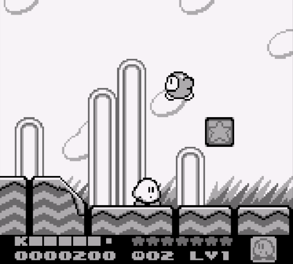
Kirby packs a lot more information onto the screen, but has to trim down the display a bit:
- Health
- Points
- Stars
- Lives
- Level
- Current Ability
Compared to the bare-bones Castlevania Adventure UI, there is a significant amount of information packed into this space. Interestingly, some elements have labels even though the player is likely to make some initial assumptions to know what they represent without playing the game. Some interesting things worth noting:
- Nintendo opted for a simple “K” to denote which of these elements is the player health bar.
- The lives indicator is an ultra-minimalist 5x7 sprite of Kirby
Many of these old games used small fonts and images as a way to condense information as much as possible to avoid wasting space that the actual gameplay could be occupying.
Odd Verdure
As a 2D platformer without a health bar for the player, the UI needs are fairly limited at a surface level. UI expands past the core gameplay for most games. This includes things like menus, title screens, and end game / credit screens. What we settled on for the original Jam submission was:
- Gameplay elements
- Tutorial
- Map
- Progress / Fly Counter
- Extended elements
- Title Screen
- End Game / Summary Screen
The post-jam version of Odd Verdure also adds:
- Achievements / Medals
- Challenge boards
- Leader boards
For moment-to-moment during gameplay, we were able to get away with one small corner element in the jam submission, and one additional corner element for the release version (so far). We opted for a menu that slides out when activated. Before we get to the slide-out menu, let’s start exploring the UI in the order the player is introduced to them during gameplay.
Tutorial
A good tutorial is probably one of the more difficult parts of game design to get right. There’s a delicate balance between calling your player stupid and not teaching them what they need to know. A good tutorial can be completely seamless, sometimes the player may not even realize it happened (The initial gameplay in Mega Man X is a great example of this). On the other hand, a bad tutorial may turn players away from your game before they even get to the actual game itself.
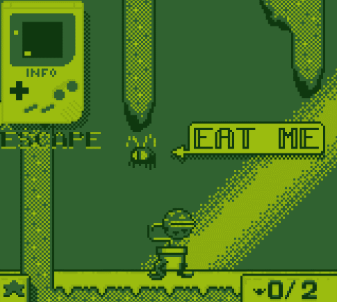
As is the nature of game jams, we had limited time to get everything built that we wanted into the game. For the tutorial, we embraced the theming of the jam and had an “info” Game Boy pop up in the top left corner to show the player how the controls work.
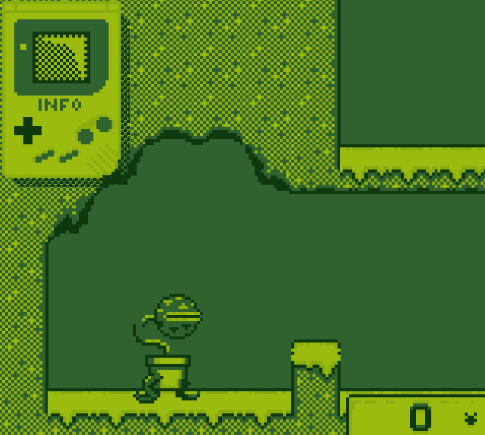
After performing the input indicated on the Game Boy, a check mark would appear and go on to the next input until the player has done everything asked. We tried to build the intro section to play nicely with the tutorial so that each input actually achieved something in the game. It feels a bit invasive, but the player is not forced to follow it if they feel capable of exploring. Once the player enters the starting door, the tutorial will be hidden.
During playtesting, multiple players didn’t even realize that this tutorial was on screen. We made this a little more obvious by having it start in the middle of the screen before going to the corner to start teaching the player.
This seemed to fix the visibility/awareness issues we were experiencing and was the version that was submitted. However, it still fell short of what we wanted as a “final product.”
Post-Jam additions
We added a little sequence for the Game Boy turning on, and added animations to the Game Boy screen to help convey what the inputs intended to make the player do. Along with some SFX juice (which won’t be heard in this article), it came out quite nicely:
Map
Another trade-off Game Boy games had to make was balancing sprite clarity/complexity with how much of the world could be on-screen at once. Many old games will have very large sprites that take up a lot of the screen and a camera that feels very zoomed in. Our game is no exception here, so we provided a map to help the player find their way around the world. For the Jam submission, it was very, VERY basic and only provided relative positioning of the player, the doors, and the flies. No terrain information was included in the map due to time constraints.
Here is a map as seen from the Title area of the game:
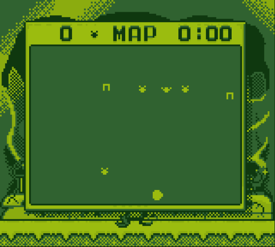
It’s pretty bland, but it does at least help the player know where the flies are – even if it doesn’t help them know how to go about getting there.
Another early piece of polish we added after the jam was to actually show the terrain to the player as part of the map.
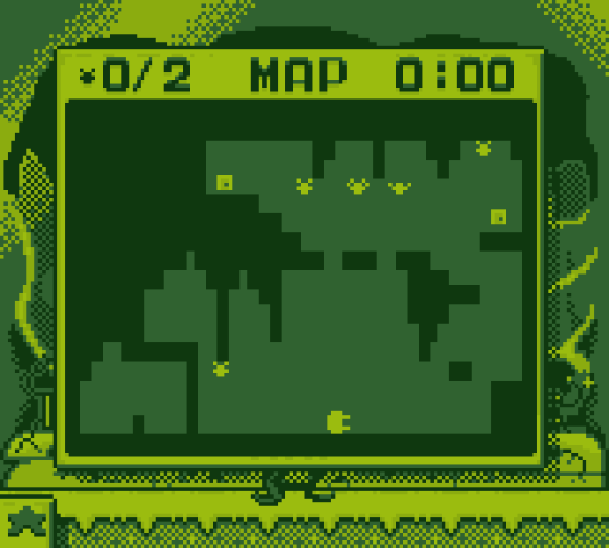
Unsurprisingly, the map can’t include too much detail due to the 4-color palette and the very limited resolution (the map is 122x92 pixels). However, the player can actually plan a route through any given level.
Progress
In the Jam version of the game, there is really only one thing marking the player’s progress: how many flies the player has collected in the current level. Our map menu is our stand-in for the entire UI, so we just put the fly counter on the corner of the map that remains visible when the map is closed. Nothing too exciting here outside of a reasonable reuse of existing elements to keep the clutter to a minimum and keep things somewhat coherent.
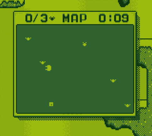
The “X/Y” counter shows how many flies the player has against how many are required to open the door.
Title Screen
To those who already played our game, you may have noticed that there is not an explicit title screen. The intro area doubles as our hub world and title screen. This was done to aid in getting our player into the action as fast as possible without having to fiddle with menus.
End game / Summary
Having a “proper” ending to a game is hard. Thankfully, the more “arcade-y” games aren’t as demanding for a conclusion as games with more story elements would be. A simple summary screen proved sufficient for the time constraints we had:
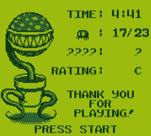
A couple elements worth noting:
- The timer can encourage engagement as players sometimes share their scores when reviewing jam games or commenting on published games. This can drive some competition among your players. This conveniently also enables some leader board integrations in the post-jam version.
- The question mark category shows if the player didn’t find any of the secrets. The hope was that this would pique the curiosity of players who missed them entirely and possibly convince them to run through again to find what they missed. If the player has found any secrets, this row acts as a count similar to the fly row.
- The Rating was also added as a way to encourage engagement and replay value. It’s purely based on completion percentage without taking time into account. In playtesting, we saw anywhere from ~7 minutes to 15+ minutes to complete the game. We didn’t want to make slower players feel bad if they took a while to get everything in the game.
This ending screen is an active area of discussion and we are considering if we want to do something different in the final version.
Achievements
While exceedingly rare in the era of gaming we are emulating with Odd Verdure, we wanted to provide some replay value into our game. Achievements, also referred to as Medals on Newgrounds (more on that integration in a later devlog), provide extra incentive and motivation to explore a game. They also have the added benefit of creating competition among friends to see who can get all the achievements.
Having achievements is easy enough, but with the small screen of a Game Boy, how do you tell the player once they’ve achieved something? A normal “toast” like PSN or XBLA tend to have a decent bit of text. It’s not always a ton of text, but it’s enough that our font would have a hard time showing during gameplay (only 14 characters fit across the width of the screen).
Part of the new Tutorial introduces the player to the Medals menu, awarding them an achievement for finishing the tutorial in the process.
The star acts both as the toast to indicate something has happened, as well as being present in the opened menu on the Medal that the player just unlocked. Also note that the star starts on the object that caused it to be unlocked. This feels like a good solution to both conveying to the player what is happening, and allowing them to investigate for further details.
The one caveat here is that we have to choose our achievements carefully so that their descriptions fit within the limitations of the screen-space. This has manifested as a fairly simple set of achievements.
All for What?
Building all of the UI elements for Odd Verdure forced us to put a lot more intentional thought into our interface compared to previous games. It’s still basic, but the exercise of condensing both information and spacial requirements has really given me an appreciation for how game UIs are built. They are another unsung hero in game design that when done correctly can elevate the player’s experience without them even realizing it.
Comments
Log in with itch.io to leave a comment.
great game and article